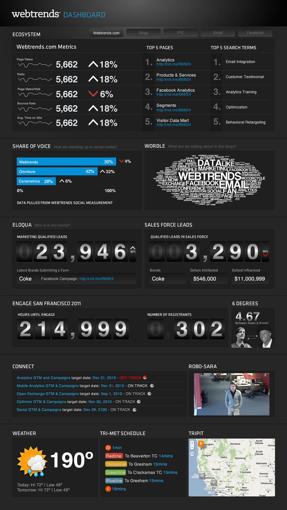
Even on a team full of data geeks, it can be hard to be inspired by data. Beyond inspiration, for a dashboard to work you need to bring data from different sources together in a way that tells a meaningful story.
Solution
This Webtrends dashboard visualized everything: from key web metrics like share of voice and leads attributed to campaigns, to bus times for team members. All in a way that clicked with the creative team.